 Price at time of writing FREE
Oh this app makes me so annoyed!
Why?
Because it's a bit like the old school reports - Metty is a good app but he could do better!
As I write this the Met Office weather application has 7500 star ratings on iTunes. If you divide down the middle those who have rated 1-3 stars and those that have given 3-5 stars it's a pretty even split and I can quite see why that split arises.
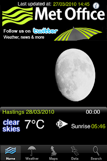
Start up this UK weather app and you are greeted by the main screen which displays the current weather conditions for your main chosen loaction (set up in favourites section of this app together with any other locations you may wish to access easily)
 This first screen is actually the most impressive - the background and displayed image relate to current conditions. The images are always nice high resolution pictures and you can also see your current weather graphic, temperature, windspeed and sunrise/sunset time. If appropriate a weather warning symbol also displays which will take you to that warning if pressed.
Now if the rest of the app was this good it would be 10/10.
However, whilst it is a free app, the Met Office really could do with paying some attention to the rest of the functions.
Top right of the menu is an (i) symbol. This is where you set your preferred wind speed measurement and chose between celcius and fahrenheit displays.OK but it just feels out of place here as if they didn't know where to stick it. A preferences tag at the bottom would have been better.
There are already 5 tags at the botton these are:

1.Home (back to the main screen)
2. Weather - click and you'll get the summary forecast for the next 5 days for your chosen location. Click on the summary and you'll get a more detailed forecast for that 24 hour period. This section is actually ok but obviously depends on the reliability of the forecast.
3. Maps - At lightning speed (although you can pause) watch a slideshow of weather maps for a 5 day period. Why the slide speed is set at about 2 frames per second is anybody's guess. I challenge anybody to be satisfied with a half second glance at a weather map.
There is also a "text icon" top right on this screen. Only the met office will have a clue why they put it here but this is your main written forecast (couldn't this be on the front screen where that (i) icon is?)
4. Data - an underwhelming infra red cloud cover satellite demonstration for the past few hours. Often these images are corrupted and surely we want future weather cloud cover forecasts? We know what has just gone!
Where is international weather?
Historic data may be interesting and weather facts too.
As it stands the app is good for the at a glance weather and for your quick forecast for the next few days.
But it needs work on everything else and as it has been out some while that should be sooner rather than later.
I'll gladly come back and increase this rating if it is improved or enhanced. As it stands it is a fast weather app which is good but has the potential to be great.
8/10 and at least it's free here
No comments:
Post a Comment